We are going to talk about how computers represent images, and the image features that are important when we use them in a webpage.
Class Preparation
1. Watch at home the following video from DIYWebmastery (7-1/2 min):
Image Formats: Understanding images
Compression
The video above is really good and summarizes the important points: for a webpage, we care about the size of the image – which affects the time it takes to load the webpage, and whether the image format supports transparency or not.
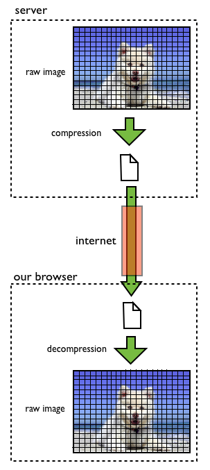
server sending an image to a browser
When a browser asks a server for an image that is part of a webpage, the server transmits the compressed version of the image; our browser receives the compressed version, and reverses the process, i.e., it decompresses the image, changing the representation back to get that of the original raw image, which it then displays on the screen. The compression process is done so often that in reality, we seldom store or transmit raw images anymore, dealing only with compressed images; the raw images are restored for displaying them, though. Transmitting a raw image would require transmitting all its pixels as bytes (a byte is a combination of 8 zeros and ones), so an image of N pixels would require us to transmit N bytes; compression rates vary with the picture but a typical value is about 1/5th of the size, i.e., 1-2 bits/pixel instead of 8 bits/pixel. So we can compress a typical 100 kbyte image to about 20 kbytes, where a kilobyte means about 1,000 bytes.
Image formats
An image format is a specific way to represent the image. The three most common images formats used in the internet are GIF (Graphics Interchange Format), JPG (Joint Photographic Experts Group), and PNG (Portable Network Graphics). One of the ways in which they are different from each other is whether they are ‘lossless’ or ‘lossy’.
‘Lossless’ compression techniques can recover exactly the image that was compressed, with no loss of image information, while ‘lossy’ compression takes advantage of the limitations of the human eye to push compression further, at the expense of not recovering the original image but one that, to our eyes, is indistinguishable from the original. Examples of lossless compression image formats are GIF and PNG, while the JPEG is an example of lossy compression.
Since lossless compression preserves the original image intact, it is often used to compress simple images in which we could detect defects easily, e.g., logos, cartoons, simple drawings, etc. Lossy compression is used to compress images in which it would be more difficult for us to detect defects, like photographs.
Good candidate for lossless compression, e.g., GIF or PNG

Good candidate for lossy compression, e.g., JPG
Transparency
An image has transparency when we can set some of their pixels as ‘see-through’. We say that these ‘transparent’ pixels belong to the ‘alpha’ channel. Let’s see what a big difference being transparent makes with our logo: the image on the left does not have transparency, while that on the right does.
left: JPG; right: PNG, or GIF
Transparency is useful in many situations, specially in video games where we might want, say, spacecrafts and people to move over complex backgrounds, and blend with them seamlessly. Image transparency is not a setting in CSS but a property of the format of the image. Well… GIFs and PNGs support transparency but JPGs do not. PNGs and GIFs do not have to have an alpha channel, but they can if we need to, while JPGs just can’t have an alpha channel. The price to pay for having an alpha channel is a slight increase in the size of the image; after all, we need to have an alpha channel in addition to the normal three color channels, so the size of a transparent image is always larger than that of its corresponding non-transparent version.
PNG: The winning format
At this moment, the format that appears to have gained the favor of the internet developers is PNG. PNG is a good compromise of size and features. It is lossless so it works well with both drawings and photographs, and supports transparency, which JPEG does not. A new format, called Jpeg-2000, supports transparency but it didn’t became popular so few applications support it. In summary:
| Format | Drawings | Photographs | Transparency | Popular |
|---|---|---|---|---|
| GIF | Yes | No | Yes | Yes |
| JPEG | Yes | Yes | No | Yes |
| Jpeg-2000 | Yes | Yes | Yes | No |
| PNG | Yes | Yes | Yes | Yes |
So, in the end, the internet is now dominated by PNGs and JPGs, but JPGs are slowly losing their importance as PNGs becomes more and more popular. Basically, PNGs have all the advantages of GIFs and JPEGs, while the price to pay is only a small increase in the image size.
Image resizing in CSS
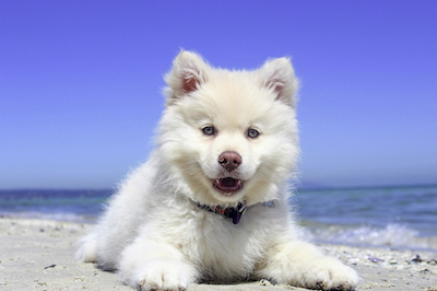
Adjusting the size of an image in CSS is easy, simply setting the element’s width and height properties. If we do not specify the width or height of an image, the browser draws the original image, e.g., the picture of the dog has 400 columns and 266 rows, so those are the dimensions that the browser will try to use to draw the picture:
<img src="images/dog.png">
We can force the browser to scale the image into a given number of columns and rows, even if the result is not proportional to the original image:
<img width="200px" height="200px" src="images/dog.png">
Still, the best way to scale an image is to make a copy of the image with the size that we want and then load the rescaled image; telling the browser the size of the rescaled image also helps the browser to separate the right amount of memory for the image even before we retrieve the image from the server. For example, ‘dog-300×200.png’ is a scaled version of the original ‘dog.png’ with 300 columns and 200 rows; let’s give all that information to the browser:
<img width="300px" height="200px" src="images/dog-300x200.png">

The following is the script with our example:
<!DOCTYPE html>
<html>
    <head>
    <head>

    <body>
        <h1>Different ways of resizing an image</h1>

        <strong>;"dog.png", no width or height specified:</strong>
        <p><img src="images/dog.png"></p>

        <strong>"dog.png", width = 200 pixels:</strong>
        <p><img width="200px" src="images/dog.png"> </p>

        <strong>"dog.png", height = 200 pixels:</strong>
        <p><img height="200px" src="images/dog.png"> </p>

        <strong>"dog.png", width = 200 px, height = 200 px:</strong>
        <p><img width="200px" height="200px" src="images/dog.png"> </p>

        <strong>"dog-300x200.png", width = 300 px, height = 200 px:</strong>
        <p><img width="300px" height="200px" src="images/dog-300x200.png"> </p>
    </body>
<html>
that we can see in action here.
Now let’s continue with one of the main ingredients of style: color.