Block-level elements
The parts of a block cause a lot of confusion when we start learning CSS. In the following example we go over them carefully, step by step.
CSS treats many types of elements as boxes; we say that these elements have a display property of value block. Examples of block elements are titles, paragraphs, and divisions. By default, a block will be as wide as it can be, and as tall as needed to fit all its content.
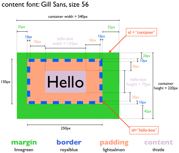
Block elements follow a box model. A box wraps around the element and consists of margins, borders, padding, and the content. We used Keynote to draw the following ‘blueprint’ of the block ‘hello-box’:
We can map the parts of a block using a normal picture:
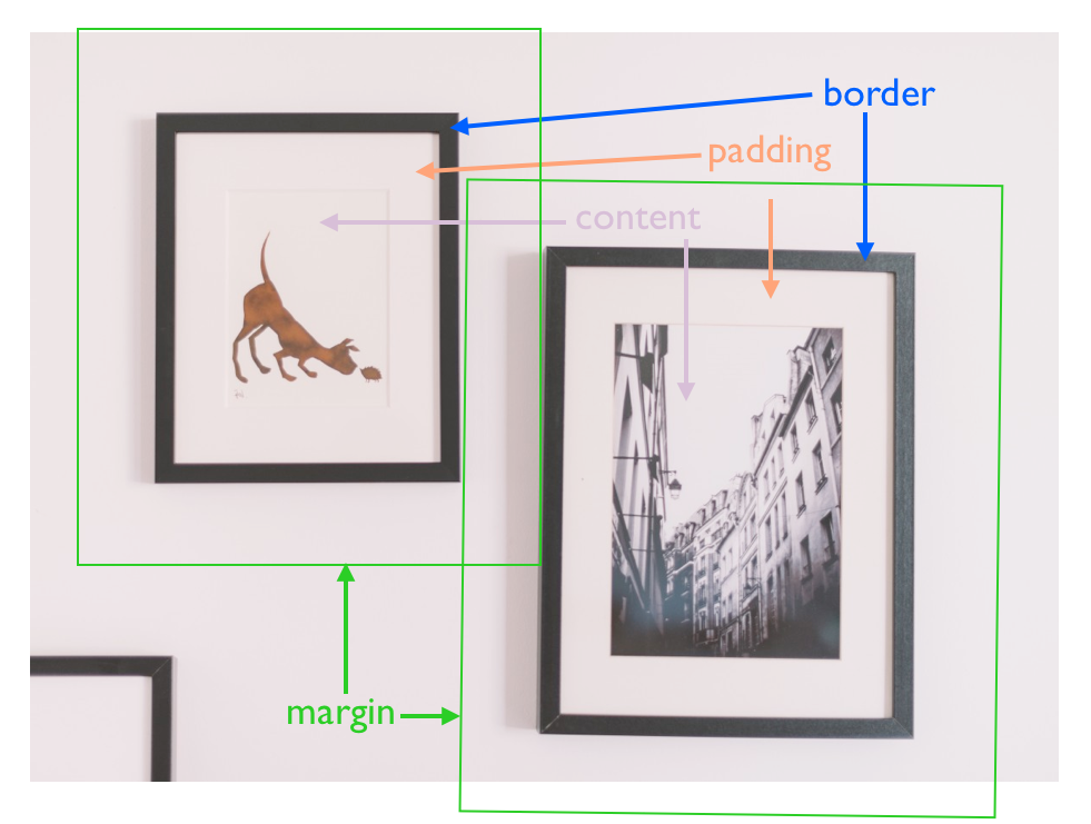
src: https://pxhere.com/en/photo/972197
- The ‘content’ of the block corresponds to the actual drawing or photograph of a picture. In CSS, the width and height properties of the element refer exclusively to the size of the content.
- The ‘padding’ corresponds to the white area between the drawing or photograph, and the frame of the picture; the technical name of the padding is the ‘mat’ or ‘passe-portout’ [wikipedia]. The role of the mat is to accentuate the content, making sure the frame, does not take the focus away from the content.
- The ‘border’ of a block corresponds to the ‘frame’ of a picture. Like real frames, CSS borders can have a multitude of styles.
- The ‘margin’ of a block corresponds to the space between pictures, e.g., we might decide that no picture is going to be closer than 6″ to any other picture. The margin moves with the picture, but it is not part of it. Sometimes, like in our example, the margins of two different pictures might overlap each other; this is fine and CSS has means to duplicate this effect.
Let’s continue. Our blueprint has the font, color and size information we need to build this block in CSS.
Our initial template
Our blueprint has 3 blocks:
- a large ‘container’ division
- a ‘hello-box’ division nested inside the ‘container’ division
- a paragraph with the content ‘Hello’ nested in the ‘hello-box’ division
We’ll start by writing an html file with an internal style sheet, with our desired structure and content:
<!-- filename: box-0.htm -->
<!DOCTYPE html>
<html>
    <head>
        <style>
        </style>
    <head>

    <body>
        <div id="container">
            <div id="hello-box">
                <p>Hello</p>
            </div>
        </div>
    </body>
<html>
Thus, our starting point is a webpage with our content but no defined style:
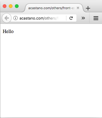
The content, Click on the image to go to the working page
Since now we are working with style it is worth paying attention to details:
- the browser is writing ‘Hello’ using a default font
- the browser is writing ‘Hello’ in a default size
- the word ‘Hello’ is not flushed against the top-left border of the page, but instead there is some default space left between the word and the edges of the page
Indeed, in the absence of specific instructions, the browser uses default fonts and spaces to make the page ‘readable’. For example, it assumes that most text is normal reading text (instead of, say, a title), so by default it writes it in a readable font and size.
Drawing the ‘container’ division
We want the width and height of the ‘container’ division to be 340 and 220 pixels, respectively, and the color of its background to be limegreen; let’s set those up:
<!-- filename: box-1.htm -->
<!DOCTYPE html>
<html>
    <head>
        <style>
            #container {
                width: 340px;
                height: 220px;
                background-color: limegreen;
            }
        </style>
    <head>

    <body>
        <div id="container">
            <div id="hello-box">
                <p>Hello</p>
            </div>
        </div>
    </body>
<html>
Now we can see the ‘container’ division:
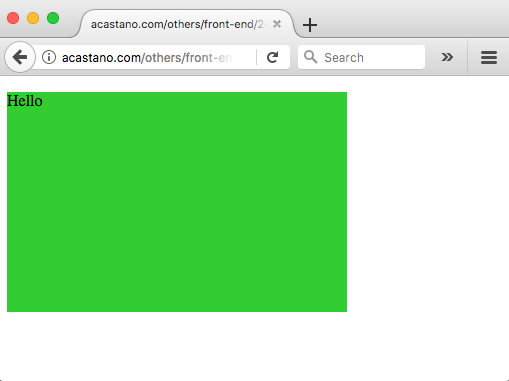
The container box, Click on the image to go to the working page
Continuing with our theme of paying attention to details, now the text is flushed against the edges of the ‘container’ division, so it is this ‘container’ division that is not flushed against the edges of the webpage. We’ll fix this next.
Block display
We want the container flushed against the edge of the webpage. The width and height of the ‘container’ block define the size of its ‘content’; since ‘container’ doesn’t have padding or border, then the size of the content is also the size of the whole division; hence, the gap between the ‘container’ and the edge of the page has to be a margin of either the body (the parent of ‘container’) or the ‘container’ division itself, and since we have not set any margin for the ‘container’ division, if follows that the body must have a default margin that is preventing the ‘container’ division from getting close to the edge of the page. We can confirm this with the list of default property values for HTML elements [w3schools]: the default properties of the body are:
body {
    display: block;
    margin: 8px;
}
We can remove this default margin of the body by setting it to 0 pixels. However this is not enough.
By default, a block has a static position, which means that it’s placed in the page according to how the page flows. This is decided by the browser. This is the reason our divisions were stacked on top of each other, following the structure of their nesting. However, since the position of a static block is determined by the structure of the document, it ignores repositioning using margins. Thus, to get our container to flush to the edge we need to change its position property from static to absolute, which accepts margin repositions. Hence, in addition of zeroing the margin of the body, we need to change the position property of the container from the default ‘static’ to ‘absolute’:
<!-- filename: box-2.htm -->
<!DOCTYPE html>
<html>
    <head>
        <style>
            body {
                margin: 0px;
            }

            #container {
                width: 340px;
                height: 220px;
                background-color: limegreen;

                position: absolute;
            }
        </style>
    <head>

    <body>
        <div id="container">
            <div id="hello-box">
                <p>Hello</p>
            </div>
        </div>
    </body>
<html>
Now the ‘container’ block is flushed against the webpage:
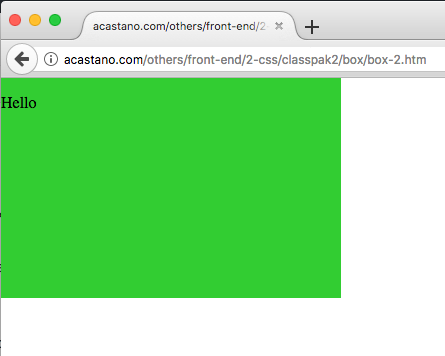
Container flushed against the edges of the page, Click on the image to go to the working page
Drawing the ‘hello-box’ division
We want the content of the block of the ‘hello-box’ division to be 135 pixels wide and 150 pixels tall, and have a ‘lightsalmon’ background color. This should be similar to drawing the block of the ‘container’ division:
<!-- filename: box-3.htm -->
<!DOCTYPE html>
<html>
    <head>
        <style>
            body {
                margin: 0px;
            }

            #container {
                width: 340px;
                height: 220px;
                background-color: limegreen;

                position: absolute;
            }

            #hello-box {
                width: 135px;
                height: 75px;
                background-color: lightsalmon;
            }
        </style>
    <head>

    <body>
        <div id="container">
            <div id="hello-box">
                <p>Hello</p>
            </div>
        </div>
    </body>
<html>
that has the following result:
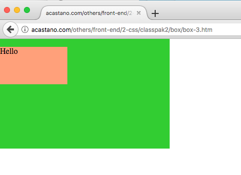
The ‘hello-box’ content, Click on the image to go to the working page
The ‘width’ and ‘height’ properties of the element are the width and height of its content, not including the padding or the border. Let’s include them one at a time.
The padding
The padding is the ‘mat’ of our elemnt. We can specify each padding individually:
#sample {
    padding-top: 30px;
    padding-right: 50px;
    padding-bottom: 30px;
    padding-left: 50px;
}
or, alternatively, we can just write them in a single command, as long as they follow a ‘top-right-bottom-left’ order:
#sample {
    padding: 30px 50px 30px 50px;
}
Our script with the padding is:
<!-- filename: box-4.htm -->
<!DOCTYPE html>
<html>
    <head>
        <style>
            body {
                margin: 0px;
            }

            #container {
                width: 340px;
                height: 220px;
                background-color: limegreen;

                position: absolute;
            }

            #hello-box {
                width: 135px;
                height: 75px;
                background-color: lightsalmon;

                padding: 30px 50px 30px 50px;
            }
        </style>
    <head>

    <body>
        <div id="container">
            <div id="hello-box">
                <p>Hello</p>
            </div>
        </div>
    </body>
<html>
and the result is:
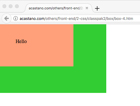
‘Hello-box’ content and padding, Click on the image to go to the working page
The border
The border is the ‘frame’ of our element. Each of the border – top, right, bottom, and left – can have a different style, color, and width, but often they share them. The border must to have a ‘border-style’; otherwise the browser ignores the ‘border-color’ and ‘border-width’ settings. The style of a border can be solid, dotted, dashed, etc. In our case, we want a 10-pixel-wide ‘royalblue’ border with a dashed style:
<!-- filename: box-5.htm -->
<!DOCTYPE html>
<html>
    <head>
        <style>
            body {
                margin: 0px;
            }

            #container {
                width: 340px;
                height: 220px;
                background-color: limegreen;

                position: absolute;
            }

            #hello-box {
                width: 135px;
                height: 75px;
                background-color: lightsalmon;

                padding: 30px 50px 30px 50px;

                border-style: dashed;
                border-width: 10px;
                border-color: royalblue;
            }
        </style>
    <head>

    <body>
        <div id="container">
            <div id="hello-box">
                <p>Hello</p>
            </div>
        </div>
    </body>
<html>
so now our ‘hello-box’ division looks like this:
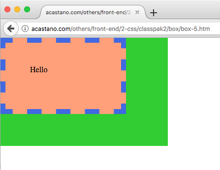
‘hello-box’ with content, padding and border, Click on the image to go to the working page
The margin
Finally, we need to position our ‘hello-box’ in its correct place using margins. Like the padding and the borders, we can set margins individually or all at once, as long they follow the ‘top-right-bottom-left’ order. According to our blueprint, we want top, right, bottom, and left margins of 20, 55, 45, and 35 pixels, respectively. And ss before, we have to change the default positioning method of our block to something other than the default ‘static’, so again we’ll just set it to ‘absolute’:
<!-- filename: box-6.htm -->
<!DOCTYPE html>
<html>
    <head>
        <style>
            body {
                margin: 0px;
            }

            #container {
                width: 340px;
                height: 220px;
                background-color: limegreen;

                position: absolute;
            }

            #hello-box {
                width: 135px;
                height: 75px;
                background-color: lightsalmon;

                padding: 30px 50px 30px 50px;

                border-style: dashed;
                border-width: 10px;
                border-color: royalblue;

                position: absolute;
                margin: 20px 55px 45px 35px;
            }
        </style>
    <head>

    <body>
        <div id="container">
            <div id="hello-box">
                <p>Hello</p>
            </div>
        </div>
    </body>
<html>
so now we have:
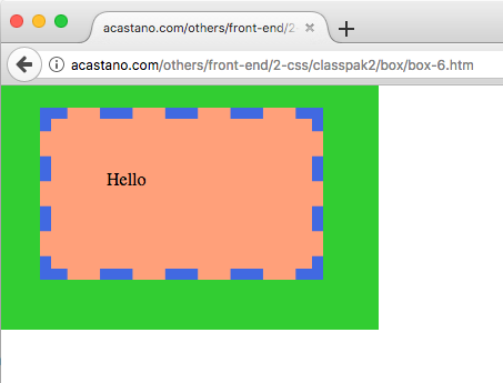
‘hello-box’ with content, padding, border, and margin, Click on the image to go to the working page
The content
We are in the final stretch. Let’s set the style of the content of the ‘hello-box’ division, i.e., the paragraph. We want the background color of the paragraph to be ‘thistle’, the font size to be 56 pixels, and the font family to be ‘Gill Sans’. When we set the font family, we include other fonts that the browser can use if it doesn’t have our first choice. We are going to apply our style to all the paragraphs, i.e., to all the <p> elements:
<!-- filename: box-7.htm -->
<!DOCTYPE html>
<html>
    <head>
        <style>
            body {
                margin: 0px;
            }

            #container {
                width: 340px;
                height: 220px;
                background-color: limegreen;

                position: absolute;
            }

            #hello-box {
                width: 135px;
                height: 75px;
                background-color: lightsalmon;

                padding: 30px 50px 30px 50px;

                border-style: dashed;
                border-width: 10px;
                border-color: royalblue;

                position: absolute;
                margin: 20px 55px 45px 35px;
            }

            p {
                background-color: thistle;
                font-family: Gill Sans,Gill Sans MT,Calibri,sans-serif;
                font-size: 56px;
            }
        </style>
    <head>

    <body>
        <div id="container">
            <div id="hello-box">
                <p>Hello</p>
            </div>
        </div>
    </body>
<html>
that looks like this:
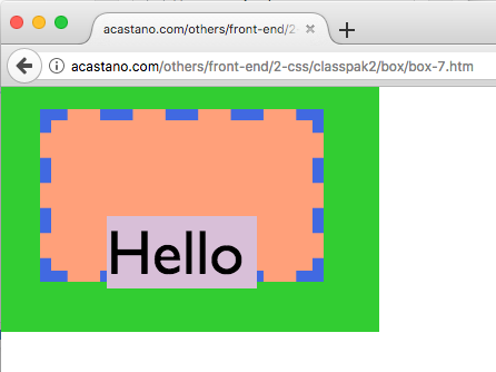
Setting the content, Click on the image to go to the working page
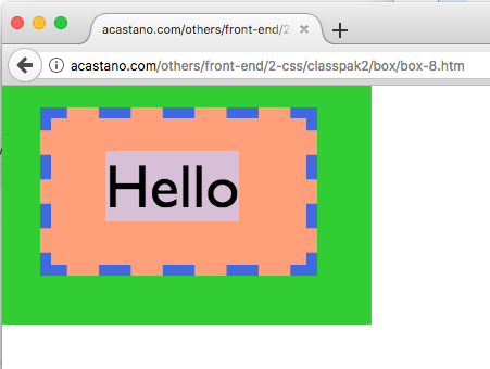
Margins again
The content looks like we want it to, but it is at the wrong place and, again, the culprit is the default margin of the paragraph element. And again, the fix is simply to set the positioning of the element to something other than the ‘static’ default, and to zero the margin:
<!-- filename: box-8.htm -->
<!DOCTYPE html>
<html>
    <head>
        <style>
            body {
                margin: 0px;
            }

            #container {
                width: 340px;
                height: 220px;
                background-color: limegreen;

                position: absolute;
            }

            #hello-box {
                width: 135px;
                height: 75px;
                background-color: lightsalmon;

                padding: 30px 50px 30px 50px;

                border-style: dashed;
                border-width: 10px;
                border-color: royalblue;

                position: absolute;
                margin: 20px 55px 45px 35px;
            }

            p {
                background-color: thistle;
                font-family: Gill Sans,Gill Sans MT,Calibri,sans-serif;
                font-size: 56px;

                position: absolute;
                margin: 0px;
            }
        </style>
    <head>

    <body>
        <div id="container">
            <div id="hello-box">
                <p>Hello</p>
            </div>
        </div>
    </body>
<html>
This concludes our toy project. The following are our initial goal designed in Keynote, and our final result running in a browser:
Final result, Click on the image to go to the working page
The results are not identical because the font in keynote and the browser are not identical; likewise, the dashed line is done differently. All in all, though, we did a good job mapping our desired design.
Final comments
This was a long session but hopefully it was useful. Do not be deceived if it looked easy. Sizing and moving css boxes around can be drive anyone crazy. The following might help you when you tackle your own desing:
- We need a very clear objective: what is it that we want to achieve
- We proceed step by step, making sure we understand the effects of what we just did
- Be very patient
Now that our brains are overflowing with knowledge, let’s continue with our fan page.