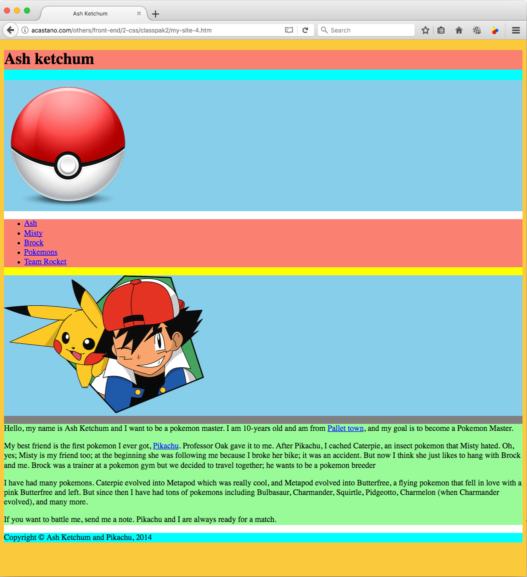
One of the difficulties of writing CSS scripts is that we cannot ‘see’ the different divisions we set up in HTML. Let’s see the latest version of our fan page:
We set up 11 divisions in this webpage but we cannot tell where they are because the color of all their backgrounds is either yellow or white.
Separating the divisions
A way to ‘see’ the divisions is to temporarily set their backgrounds to different colors in the CSS file; we can remove these phony backgrounds when we finish writing the webpage.
/* classes are targeted as .class-name */
.yellow-bg {
	background-color: rgb(251,202,60);
}

/* ids are targeted as #id */
#container {
    background-color: white;
}

/* --- temporary backgrounds --- */

#header, #footer {
    background-color: aqua;
}

#content {
    background-color: yellow;
}

#title {
    background-color: salmon;
}

#nav {
    background-color: salmon;
}

#main {
    background-color: gray;
}

#logo, #my_pic {
    background-color: skyblue;
}

#my_text {
    background-color: palegreen;
}
The result of setting the background of each division to a different color is:
background drawing order
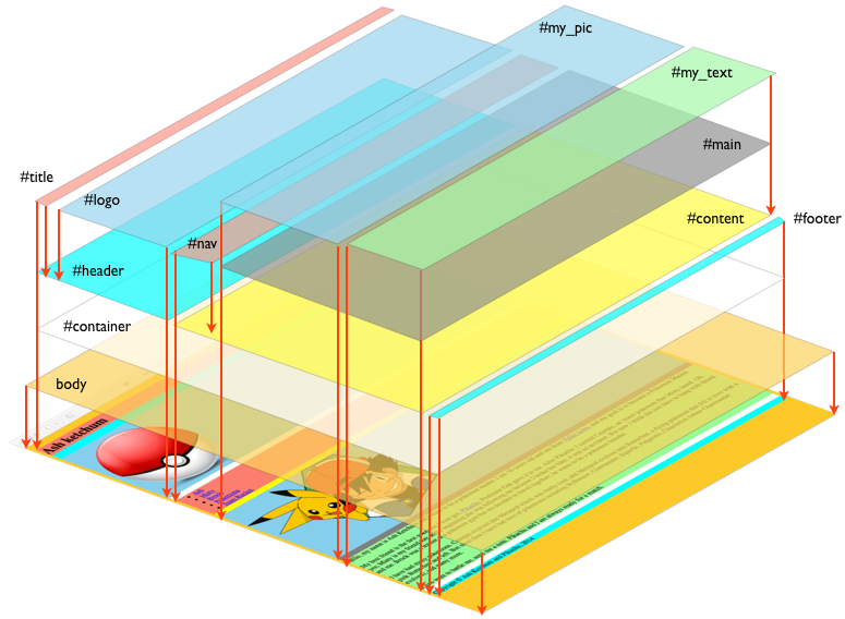
Since we have not specified any position or size for any division, the browser assumes that all of them are boxes as wide as the webpage and as tall as needed to fit their content; by default the browser draws adjacent divisions on top of each other, in a stack, and draws nested divisions in the nesting order that we set up in HTML:
- body
- #container
- #header
- #title
- #logo
- #content
- #navigation
- #main
- #my_pic
- #my_text
- #footer
- #header
- #container
For example, the browser draws the #title box over the #header box, which it draws over the #container box, which it draws over the #body box. In summary, the boxes of the innermost nested divisions – highlighted in red – are always completely visible, and occlude the boxes of the divisions in which they are nested. Adjacent divisions nested at the same depth are stacked, e.g., #title and #logo, or, #mypic and #mytext. It looks something like this:
The CSS model treats the different divisions as located in a different ‘levels’ of a stack; this ‘level’ is called the z-index and its a property of each element that we can change, i.e., we can set the drawing order to a specific one. Elements with larger z-index are drawn over elements with smaller z-index.
We might think that divisions have a lot to do with boxes, and we would be right. Let’s go over how CSS treats boxes and some ways to move them around.


